Introduction
An effective landing page doesn’t just look good—it converts visitors into subscribers, leads, or customers. Unlike a website’s homepage, which must serve multiple purposes, a landing page has a singular mission: drive a specific action. Whether you’re promoting a free e-book, collecting email addresses, or selling a product, the right combination of clear messaging, persuasive design, and user-friendly functionality can skyrocket your conversion rates. In this post, we’ll explore the essential components that make a landing page not just informative, but irresistible—and show you how to implement each element for maximum impact.

1. A Compelling, Benefit-Focused Headline
Your headline is the first thing visitors see—it must grab attention and communicate the primary value.
- Clarity over cleverness: Clearly state what’s on offer (“Get Your Free SEO Audit Today”), rather than vague puns.
- Highlight the benefit: Focus on what the user will gain (“Boost Your Traffic by 30% in 30 Days”).
- Keep it concise: Aim for 8–12 words that pack a punch.
Why it works: A strong headline immediately answers the visitor’s unspoken question: “What’s in it for me?”
2. Persuasive Subheadline or Supporting Copy
Directly under your headline, the subheadline elaborates on the promise:
- Explain how: Briefly describe how you deliver the benefit (“Our experts analyze your site and provide a tailored action plan”).
- Add context: If relevant, include social proof or urgency (“Join 10,000+ marketers” or “Offer ends this Friday”).
- Maintain scannability: Use sentence fragments or list-style copy to keep reading easy.
Why it works: The subheadline sustains the visitor’s interest and prepares them for the details that follow.
3. Hero Image or Video That Resonates
Visuals instantly convey emotion and credibility.
- Relevant visuals: Show your product in action, a screenshot of your service, or happy customers using it.
- Keep it uncluttered: Avoid overly busy images; one focal subject is best.
- Consider video: A 30–60 second explainer video can boost conversions by demonstrating value quickly.
Why it works: High-quality visuals reinforce your message and help visitors imagine themselves benefiting.
4. Clear, Action-Oriented Call to Action (CTA)
Your CTA button is the star of the page—it directs users toward the goal.
- Use strong verbs: “Download,” “Get,” “Start,” “Reserve.”
- Make it contrast: Ensure the button color stands out against the page background.
- Place it above the fold: Ideally in two locations—near the headline and again after supporting copy.
- Keep it singular: One primary CTA per page to avoid choice paralysis.

Why it works: A clear, prominent CTA reduces friction and guides visitors to the next step.
5. Benefit-Driven Bullet Points or Feature List
People scan; bullet points highlight key advantages at a glance.
- Focus on benefits: “Save 5 Hours Per Week” rather than “Includes Time-Tracking Module.”
- Limit to 3–5 points: More can overwhelm the reader.
- Use icons or bold text: Visual cues help bullets pop.
Why it works: Bullet points distill complex information into digestible highlights that reinforce your value proposition.
6. Social Proof: Testimonials, Reviews, and Logos
Trust signals reassure visitors that others have had positive experiences.
- Customer testimonials: Include name, title, and photo for authenticity.
- Ratings and reviews: Show aggregate star ratings or short quotes from credible sources.
- Logos: Highlight well-known clients or media mentions (“As featured in…”).
Why it works: Social proof leverages the psychological principle of consensus—people trust what others approve.
7. Risk Reducers: Guarantees and Certifications
Reducing perceived risk encourages action.
- Money-back guarantees: “30-day, no-questions-asked refund.”
- Security badges: SSL certificates, payment security seals, or privacy assurances (“We never share your email”).
- Free trials or demos: Allow users to test without commitment.
Why it works: When visitors feel their downside is limited, they’re more willing to convert.
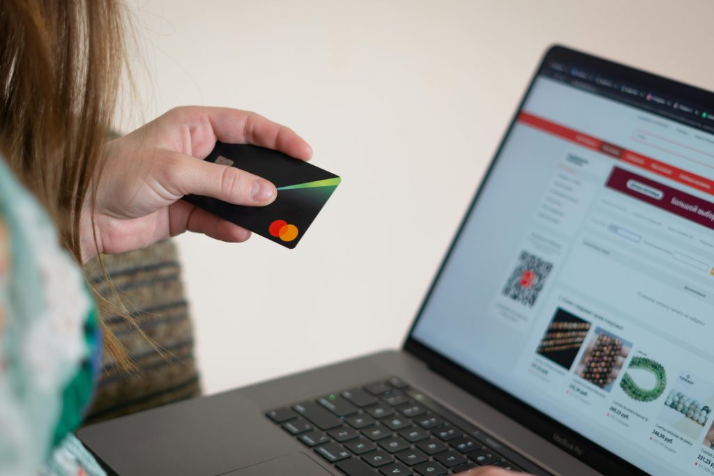
8. Optimized Lead Capture Form
The form is where conversions happen—design it thoughtfully.
- Minimize fields: 3–5 fields max; each additional field reduces conversions by ~5–10%.
- Logical flow: Order fields from least to most personal information (name → email → phone).
- Inline validation: Provide real-time feedback on errors to avoid frustration.
- Single-column layout: Easier to follow than multi-column forms.
Why it works: Streamlined forms reduce friction and abandonment.
9. Mobile-First, Responsive Design
With over half of web traffic on mobile devices, your landing page must perform flawlessly on phones and tablets.
- Responsive layout: Use flexible grids and scalable images.
- Touchable CTAs: Buttons should be large enough (at least 44×44 pixels) and spaced to prevent misclicks.
- Optimize load speed: Compress images, minify code, and leverage caching for fast mobile performance.
Why it works: A poor mobile experience drives up bounce rates and kills conversions.
10. Fast Loading Times and Technical Performance
Speed matters—every extra second of load time can cost conversions.
- Aim under 2 seconds: Google research shows bounce rates jump 32% between 1–3 seconds.
- Use CDN and caching: Distribute content globally and serve static assets efficiently.
- Lazy-load images: Defer non-critical images until after the main content loads.
Why it works: Faster pages keep visitors engaged and ready to convert.
11. Consistent Messaging and Branding
Ensure the landing page aligns with your ad, email, or social post that brought visitors there.
- Match headline and image: Visitors should feel they’ve arrived at the right place.
- Use brand colors and fonts: Maintain visual continuity to reinforce trust.
- Align tone of voice: Whether formal, friendly, or playful, keep messaging consistent.
Why it works: Consistency reduces visitor confusion and increases confidence.
12. A/B Testing and Data-Driven Optimization
Even the best-designed landing page can improve through experimentation.
- Test one variable at a time: Headlines, CTAs, images, form length, or color schemes.
- Use heatmaps and session recordings: Tools like Hotjar or Crazy Egg reveal where users click and scroll.
- Track core metrics: Conversion rate, bounce rate, and time on page to gauge success.

Why it works: Continuous testing uncovers what resonates most with your audience, leading to incremental gains.
Conclusion
An effective landing page is a fine balance of persuasive copy, uncluttered design, trust signals, and technical performance—all focused on a single, clear call to action. From a compelling headline through benefit-driven bullets to a streamlined lead form and robust social proof, each element plays a vital role in guiding visitors toward conversion. By implementing these best practices and adopting a mindset of ongoing A/B testing and optimization, you’ll create landing pages that not only attract traffic but convert it into real business results.